Meta Fab Inc.
Design
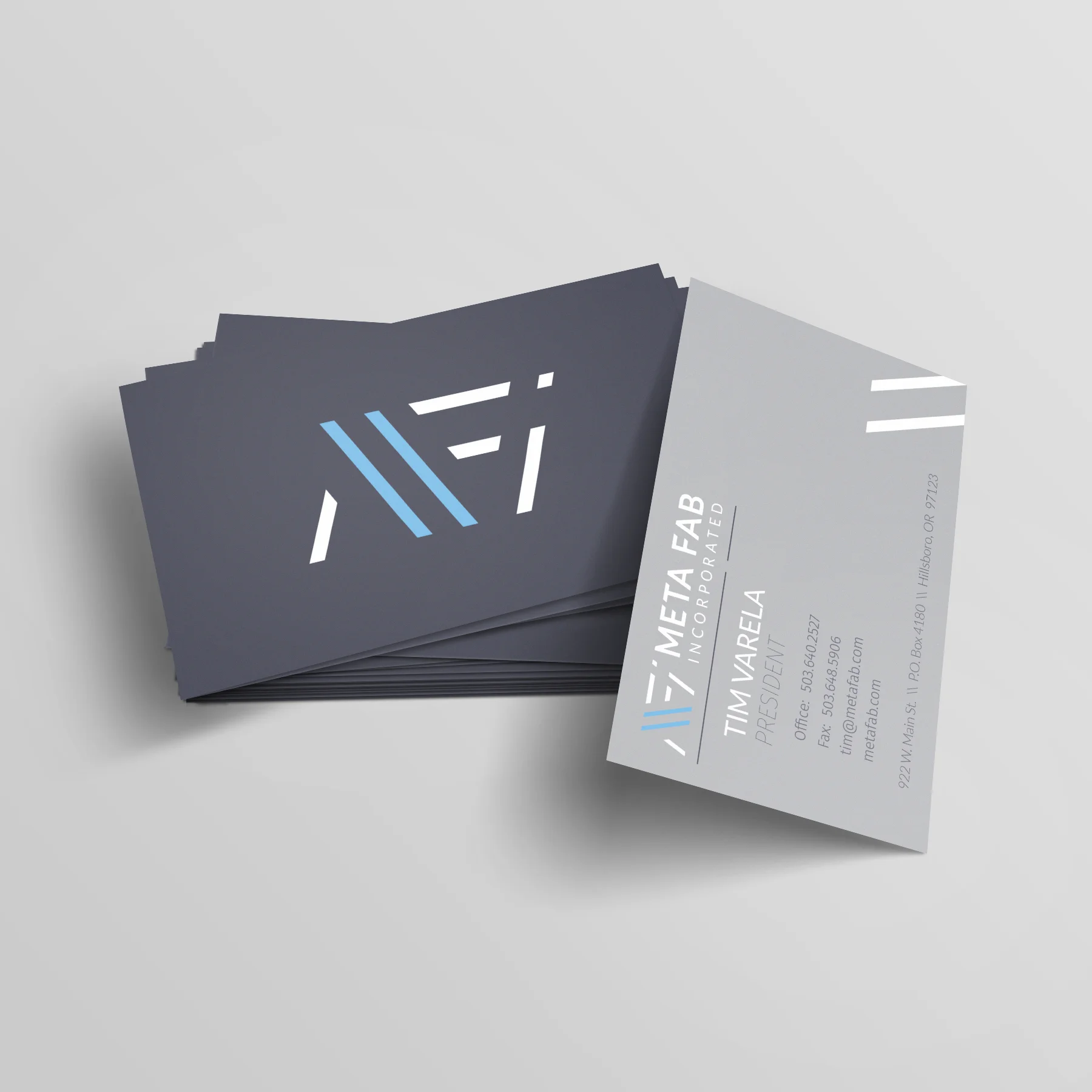
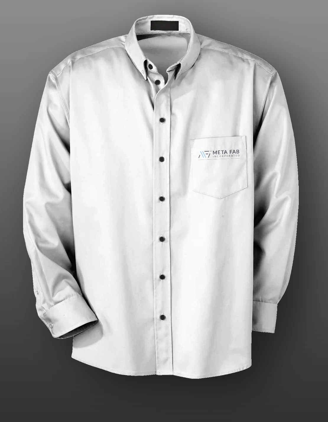
Meta Fab Inc.'s original logo and brand identity leaned heavy and masculine but I felt that it didn't fully capture what makes steel remarkable. My redesign gave the brand a new sense of lightness, one that spoke to the strength of steel rather than just its weight, and I carried that same philosophy through the full identity system, from business papers to apparel.
Rather than filling those deliverables with busy graphics, I kept the design restrained, relying on small pops of color and a recurring motif of two diagonal punch marks throughout the system. It ties every piece of the identity together, and it consistently draws the eye to the most important part of each design.